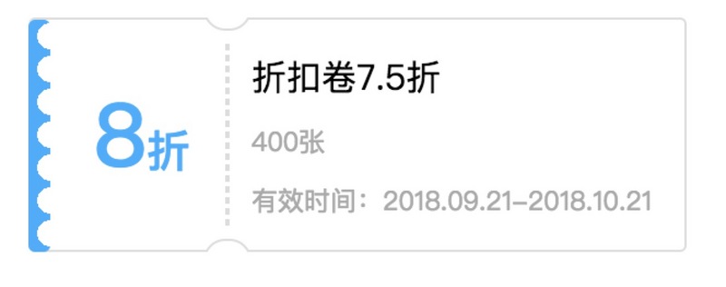
先看效果图
由于是截图,大小有些失真
实现分析 看到这个图,思考一下,就能明白,其实就两个难点:
左边的锯齿状是如何实现
中间的凹陷是如何实现
上述两个难点解决了,相信有 css 基础的都能写出这个组件。
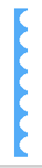
实现锯齿效果 方法一:伪元素 before 和 after 1 2 3 4 5 6 7 8 9 10 11 12 13 14 15 16 17 18 19 20 21 22 23 24 25 26 27 28 29 30 31 32 33 .sawtooth { position : relative; background :#e24141 ; width :400px ; height :170px ; } .sawtooth :before , .sawtooth :after { content : ' ' ; width : 0 ; height : 100% ; position : absolute; top : 0 ; } .sawtooth :before { border-right : 10px dotted white; left : -5px ; } .sawtooth :after { border-left : 10px dotted white; right : -5px ; } <div class="sawtooth"></div>
效果如下:
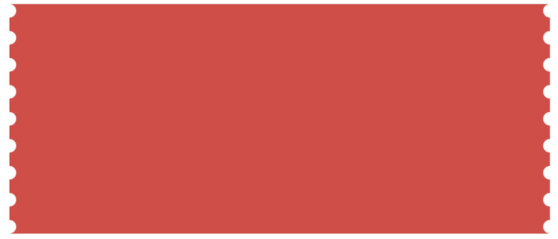
讲解 这个就是在开头和最后画了一个点状边框,然后平移边框,让边框的一部分覆盖原来的边框,利用圆点的颜色和背景色一样的特点,制作锯齿效果。如果不平移边框效果如下:
1 2 3 4 5 6 7 8 9 10 11 12 13 .sawtooth :before { border-right : 10px dotted white; left : 0 ; } .sawtooth :after { border-left : 10px dotted white; right : 0px ; }
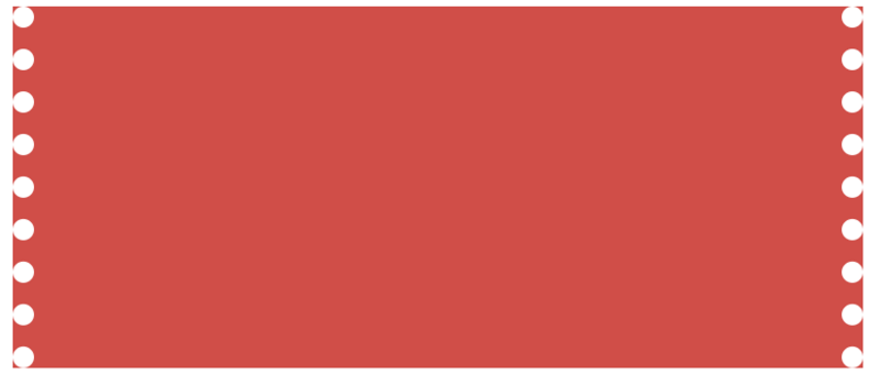
看了上图实现原理是不是一目了然了。但这也有一些缺点: 1.锯齿的颜色必须和背景色一样 2.无法画锯齿朝里的方式 ###方法二 radial-gradient 设置背景radial-gradient(circle, red 10px, blue 20px, yellow 30px);
1 2 3 4 5 6 .div { margin : 20px ; height : 100px ; width : 100px ; background-image : radial-gradient (circle, red 10px , blue 20px , yellow 30px ); }
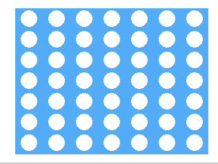
使用 radial-gradient 画圆点背景
圆心设置成透明
把过度颜色都设置成锯齿的颜色
通过背景尺寸属性设置背景图的颜色,然后 repeate
1 2 3 4 5 6 7 .div { margin : 20px ; height : 106px ; width : 140px ; background-image : radial-gradient (circle at center, transparent 6px , #28 acff 7px ); background-size : 20px 15px ; }
这样一个带圆点背景的 div 就出来了。然后通过设置宽度,只显示半个圆,左边的锯齿就出来了。width 设置成 10px 如下效果
上边凹槽的实现 这个实现就比较简单了,通过绝对定位,用一个圆形元素覆盖父元素的边框。 ###问题:子元素无法覆盖父元素
一个 div 顶级容器,设置成相对定位。(解决无法覆盖问题)
一个 div 组件容器,放到上面的 div 中
锯齿 div(放到 2 中的的 div)
粗体显示折扣的 div(放到 2 中的的 div)
虚线 div(放到 2 中的的 div)
折扣详情 div(放到 2 中的的 div)
两个圆形 div,放到 1 或 2 中 div 都可以。
code 1 2 3 4 5 6 7 8 9 10 11 12 13 14 15 16 17 18 19 20 21 22 23 24 25 26 27 28 29 30 31 32 33 34 35 36 37 38 39 40 41 42 43 44 45 46 47 48 49 50 51 52 53 54 55 56 57 58 59 60 61 62 63 64 65 66 67 68 69 70 71 72 73 74 75 76 77 78 79 80 81 82 83 84 85 86 87 88 89 90 91 92 93 94 .parentContainer { position :relative; margin :20px ; overflow :hidden; } .container { display :flex; border :1px solid #ddd ; border-radius :3px ; width :300px ; height :105px ; border-left :0 ; } .left { width :10px ; height :106px ; left :-1px ; border :0px solid #ddd ; border-radius :3px ; background-image :radial-gradient (circle at center,transparent 6px ,#28 ACFF 4px ); background-size :20px 15px ; z-index :1 } .couponName { text-align :center; border :0px solid red; line-height :106px ; font-size :40px ; font-family :PingFangSC-Medium; font-weight :500 ; color :rgba (40 ,172 ,255 ,1 ); margin-left :20px ; margin-right :16px ; } .subName { font-size :20px ; } .topSemicircle { width :20px ; height :20px ; border :1px solid #ddd ; border-radius :10px ; position :absolute; left :80px ; top :-16px ; padding :0 ; background-color :#fff ; } .bottomSemicircle { width :20px ; height :20px ; border :1px solid #ddd ; border-radius :10px ; position :absolute; left :80px ; bottom :-16px ; padding :0 ; background-color :#fff ; } .dashed { border :1px dashed #ddd ; margin-top :11px ; margin-bottom :11px ; } .right { display :flex; flex-direction :column; justify-content :center; align-items :flex-start; padding-left :10px ; } .desc { font-size :10px ; font-family :PingFangSC-Regular; font-weight :400 ; color :rgba (170 ,170 ,170 ,1 ); margin-top :10px ; } <div class="parentContainer"> <div class="container"> <div class="left"></div> <div class="couponName">8<span class="subName">折</span></div> <div class="dashed"></div> <div class="right"> <div>折扣卷7.5折</div> <div class="desc">400张</div> <div class="desc">有效时间:2018.09.21-2018.10.21</div></div> <div class="topSemicircle"></div> <div class="bottomSemicircle"></div> </div> </div>
可以把代码赋值到下面的在线工具中看下效果
https://c.runoob.com/front-end/61
React Code
根据自己需要再写成 react 版本,就易如反掌了。
1 2 3 4 5 6 7 8 9 10 11 12 13 14 15 16 17 18 19 20 21 22 23 24 25 26 27 28 29 30 31 32 33 34 35 36 37 38 39 40 41 42 43 44 45 46 47 48 49 50 51 52 53 54 55 56 57 58 59 60 61 62 63 64 65 66 67 68 69 70 71 72 73 74 75 76 77 78 79 80 81 82 83 84 85 86 87 88 89 90 91 92 93 94 95 96 97 98 99 100 101 102 103 104 105 106 107 108 109 110 111 112 113 114 115 116 117 118 119 120 121 122 123 124 125 126 127 128 129 130 131 132 133 134 135 136 137 138 139 140 141 142 143 144 145 146 147 148 149 150 151 152 153 154 155 156 157 158 159 160 161 //less .parentContainer { position : relative; margin : 20px ; overflow : hidden; } .container { display : flex; border : 1px solid #ddd ; border-radius : 3px ; width : 312px ; height : 105px ; border-left : 0 ; } .left { width : 10px ; height : 106px ; left : -1px ; border : 0px solid #ddd ; border-radius : 3px ; background-image : radial-gradient ( circle at center, transparent 6px , #28 acff 4px ); background-size : 20px 15px ; z-index : 1 ; } .leftInvalid { .left; background-image : radial-gradient ( circle at center , transparent 6px , #aaaaaa 4px ); } .couponName { text-align : center; border : 0px solid red; line-height : 106px ; font-size : 40px ; font-family : PingFangSC-Medium; font-weight : 500 ; color : rgba (40 , 172 , 255 , 1 ); min-width : 62px ; margin-left : 20px ; margin-right : 16px ; } .couponNameInvalid { .couponName; color : #aaaaaa ; } .title { font-size : 16px ; font-weight : 400 ; color : rgba (51 , 51 , 51 , 1 ); } .invalidTitle { .title; color : rgba (170, 170, 170, 1); } .subName { font-size : 20px ; } .semicircle { width : 20px ; height : 20px ; border : 1px solid #ddd ; border-radius : 10px ; position : absolute; left : 98px ; padding : 0 ; background-color : #fff ; } .topSemicircle { .semicircle; top : -16px ; } .bottomSemicircle { .semicircle; bottom : -16px ; } .dashed { border : 1px dashed #ddd ; margin-top : 11px ; margin-bottom : 11px ; } .right { display : flex; flex-direction : column; justify-content : center; align-items : flex-start; padding-left : 10px ; } .desc { font-size : 10px ; font-family : PingFangSC-Regular; font-weight : 400 ; color : rgba (170 , 170 , 170 , 1 ); margin-top : 10px ; } //组件代码 import React, { PureComponent } from 'react' import styles from './index.less' export default class CouponCard extends PureComponent { render() { const { valid = true, data = { id : 2323, couponDescription: '折扣卷8.5折', validDate: '2018.08.22-2018.09.12', number : 23, amount : 8.5 , unit: '折', }, } = this.props const amounts = data.amount.toString().split('.') return ( <div className={styles.parentContainer}> <div className={styles.container}> <div className={valid ? styles.left : styles.leftInvalid} /> <div className={valid ? styles.couponName : styles.couponNameInvalid}> {amounts[0]} <span className={styles.subName}> {amounts[1] ? `.${amounts[1]}` : ''} {data.unit} </span> </div> <div className={styles.dashed} /> <div className={styles.right}> <div className={valid ? styles.title : styles.invalidTitle}> 折扣卷{data.amount} {data.unit} </div> <div className={styles.desc}>{data.number}张</div> <div className={styles.desc}>有效时间:{data.validDate}</div> </div> <div className={styles.topSemicircle} /> <div className={styles.bottomSemicircle} /> </div> </div> ) } }
参考链接